Rob Dolton
|
Interfaces for Moving machines
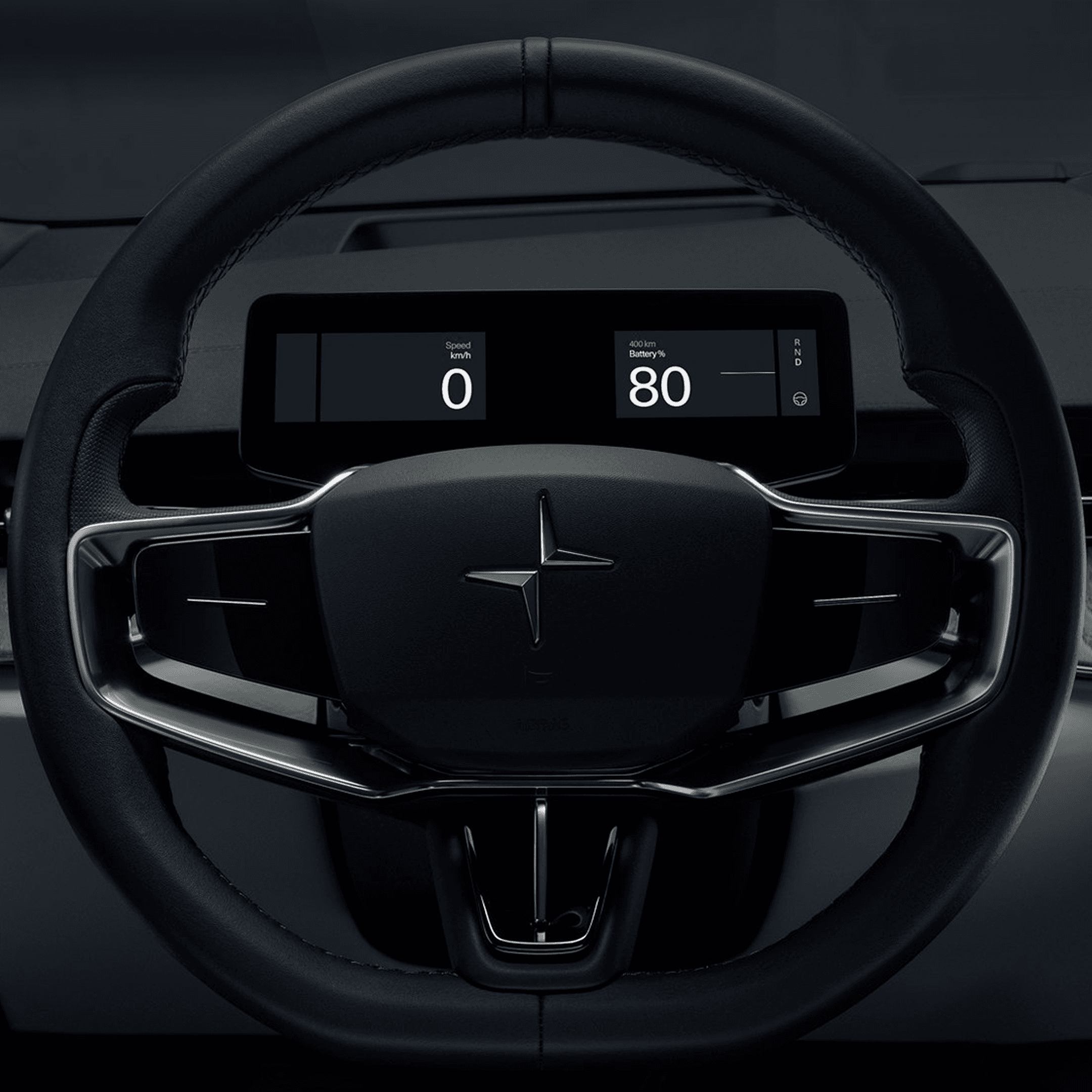
The instrument cluster and the HUD are the primary driving interfaces. The centre screen is tertiary.

The instrument cluster and the HUD are the primary driving interfaces. The centre screen is tertiary; this is often overlooked as ever-larger centre screen real estate dominates the interior. But in my opinion, this represents a misstep for brands where driving and driving interfaces are still the primary goal of the vehicle interior.
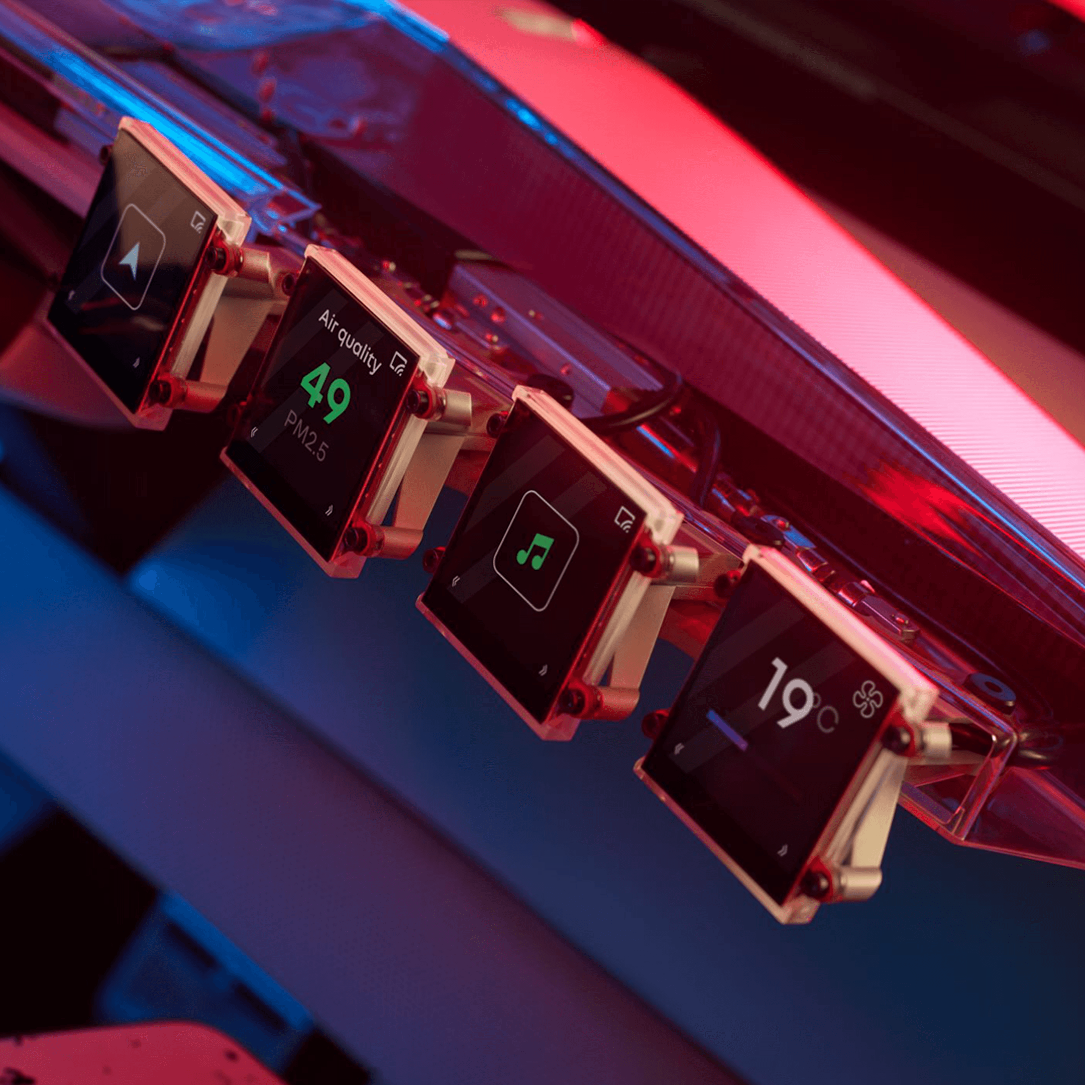
For those companies where the third space is more important, the centre screen comes into play far more, but many are being sucked into an arms race of real estate that makes little sense. Using digital displays to relay driving information IS a killer application, it allows us to manage complex information with elegance if we think about the following:
What information should always be available?
What information appears only when needed?
When should information gracefully disappear?
Effective UI should explain itself instantly; it builds an unbreakable trust with the user. The mistake that is often made is in over-styling in order to signal the “capability of the technology”. If we look back at great analogue vehicle interiors, information can be scanned and consumed with ease: this should still be the design benchmark.
Navigation and ADAS systems have added a layer of complexity, however that makes simplicity and trust more important, not less. There are too many UI designers who don’t think about driving as the primary use case. The number one rule with automotive UI should always be “just because you can, doesn’t mean you should”. We all need to remember this when being pushed to add complexity, more motion, endless skins, colourways and modes.
This doesn’t mean removing creativity; it means promoting it. Great UI needs to communicate beauty AND be uncompromisingly practical.